Wandering the Mid-Century
What's the best thing about having the Slash team spread over different parts of the world? All the interesting things they show us from different parts of the world of course.
One of those very interesting things is the architecture of Arizona State University, a highlight reel of mid-century architecture on a campus sized scale. It's lines, shapes, angles, symmetry and forms that make hearts of design-lovers flutter, and one of our crew is right in amongst it.
Here's ASU through Joana's eyes.
Arizona State University is the largest university in the United States, with over 90,000 students over all the campuses. The main campus is located in Tempe, Arizona, and that’s the one that I go to for Environmental Design.
For this blog post, I’ll do a breakdown of what I think to be the coolest parts of the Tempe campus. The main focus will be architecture, but also what influences the environment around the buildings, the flow of students, the sustainable aspects, etc — in the end, they all factor into the design of the buildings themselves.
My Favorite Thing: The (Lattie F.) Coor Hall:
This was one of the buildings that I’ve had classes in ever since my freshmen year at ASU and it’s probably my favorite. The overall look of the building is concrete foundations, with an elevated ground floor lifted by concrete pillars in which students walk through either to get to the other side of the street, or to take the stairs to the lower floor or the building itself. The upper floors are these transparent-blue windows and I'm not actually sure what's up there… BUT the coolest part is the lower level. It’s mostly smaller classrooms or computer labs, but the open hallways are made of concrete and it’s the ultimate image of raw, clean architecture.
What the Tempe campus does best in the almost-perfect relationship between mid-century architecture and the surrounding environment, whether it’s Tempe or nature and vegetation. They managed this by having the campus spread over such a large area, leaving enough space for people flow, the buildings themselves and the sustainable aspect, which the university is most known for.
Each building is designed differently, whether it is by a specific architect or not, the architecture varies according to the theme of classes held there. For example, the music buildings are mostly round, and with high ceilings, for better acoustics and enough space for musicians. Most of their exterior is simple, using plain colors and basic geometric features, but their combination overall creates an awesome style that is then integrated into the path from where the building can be accessible. And that is how the campus never goes out of style.

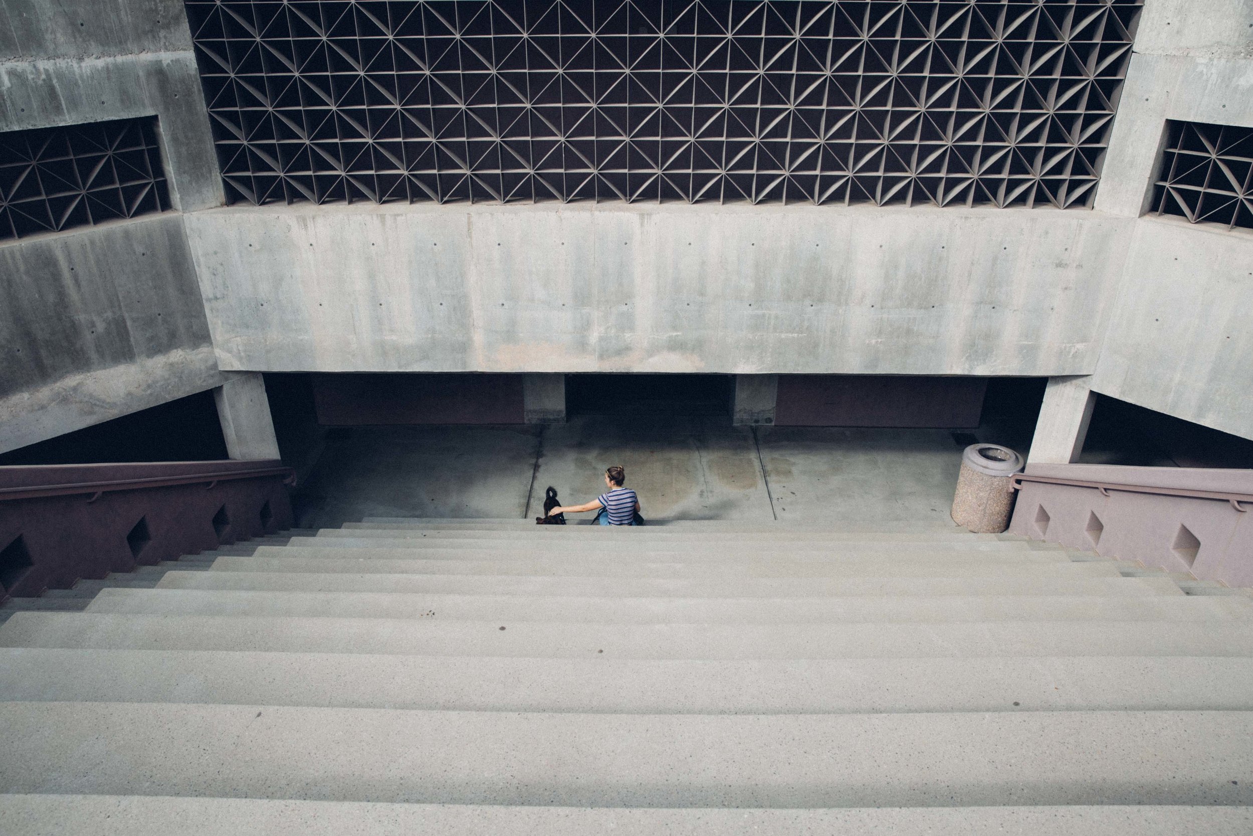
ASU Art Museum at Nelson Fine Arts Center:
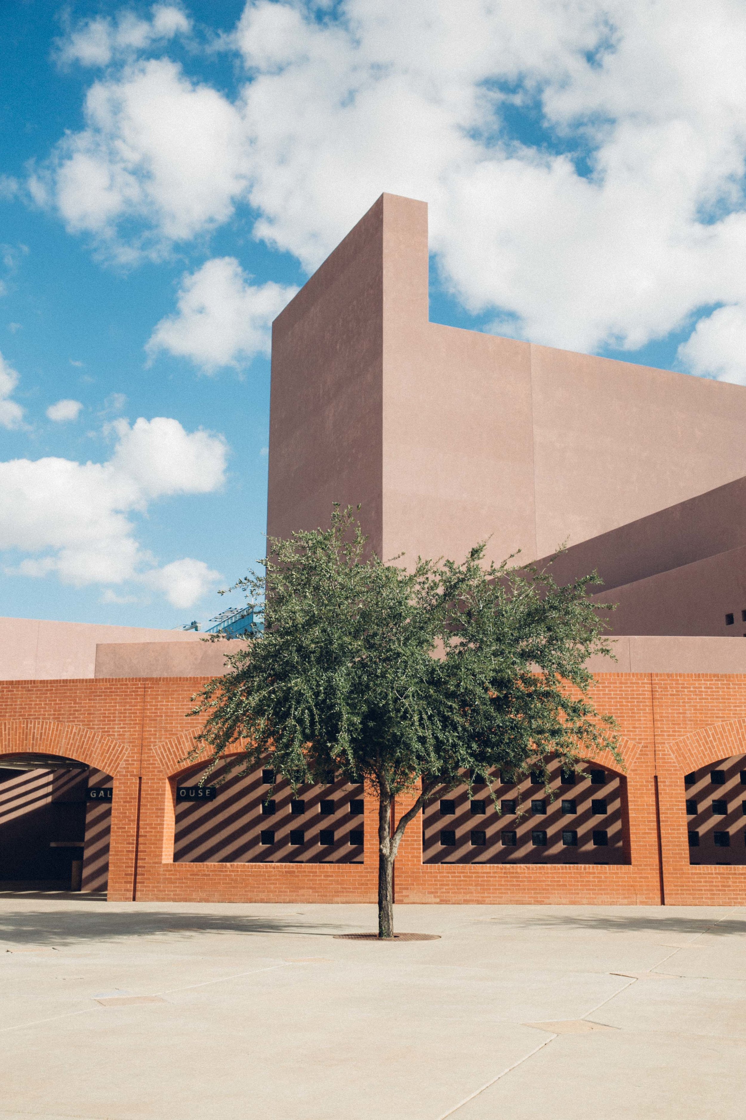
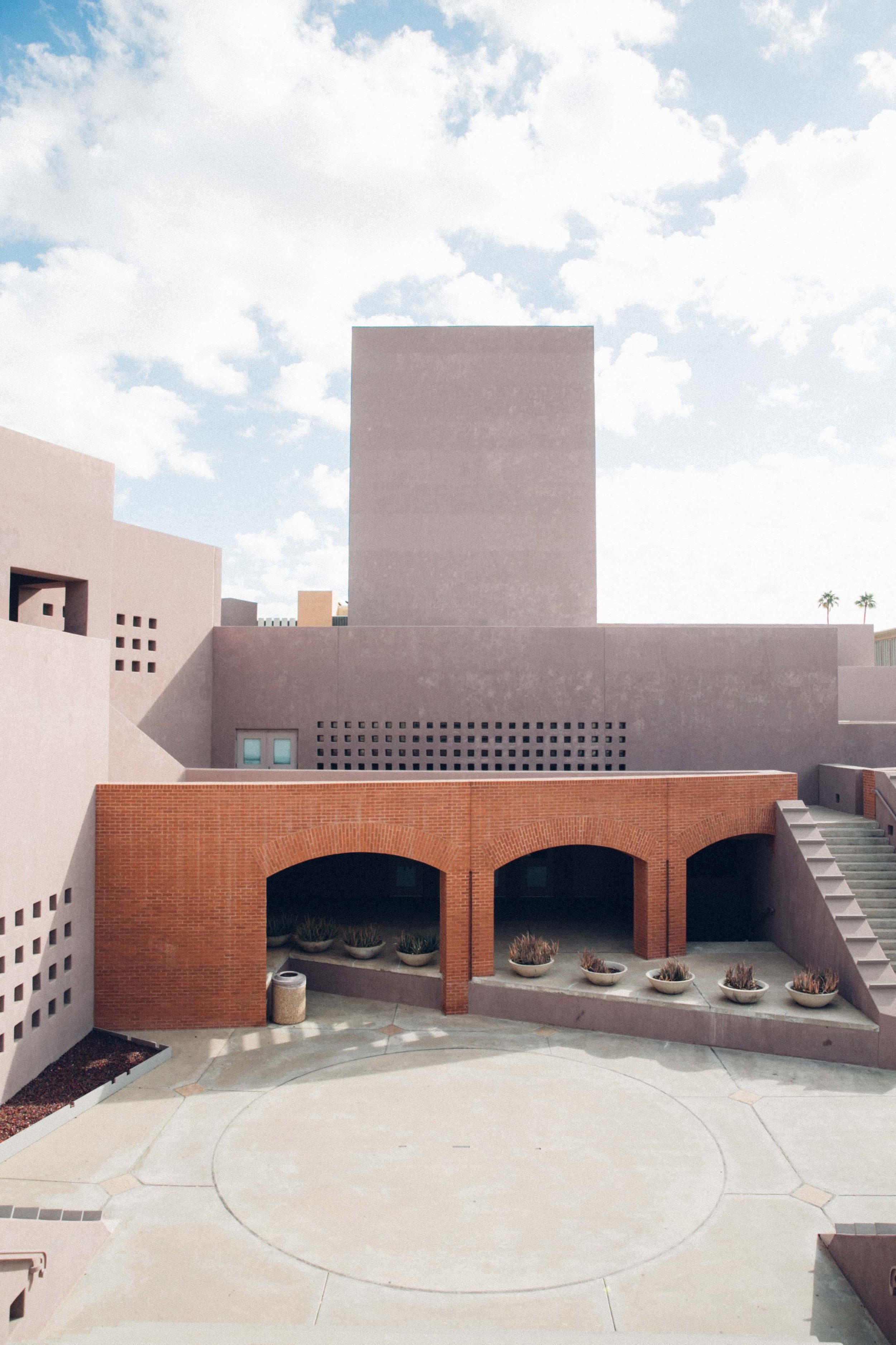
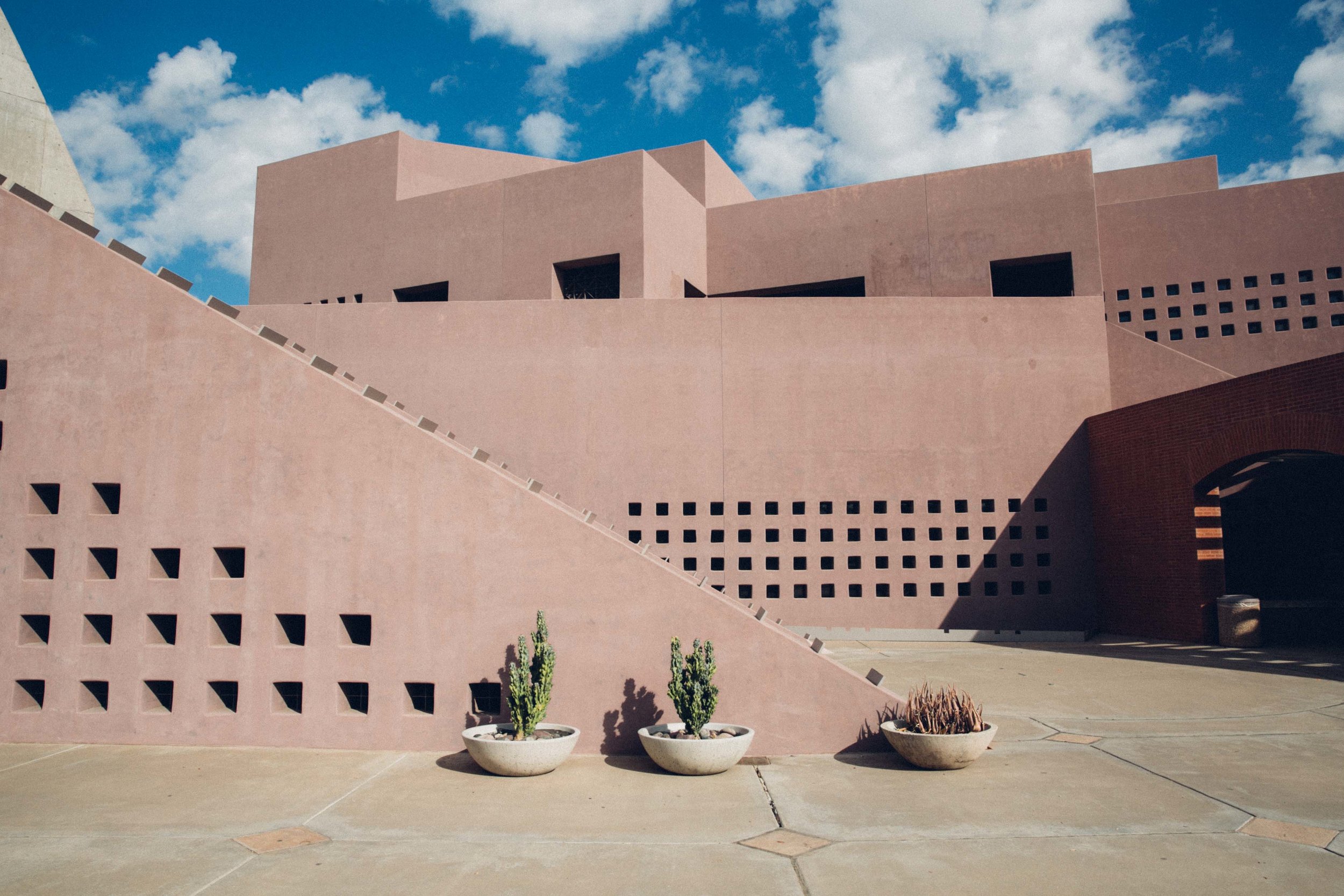
The ASU Tempe campus Art Museum was designed by Antione Predock, in 1989. The design quotes from the history of desert architecture to respond to the environment and climate of the site, which is shown in the color palette chosen and the simplicity of the surfaces. He uses a lot of geometry instead of organic shapes, to contrast with the surrounding desert landscape. The materials, although quite basic (cement, brick, steel), are the perfect contrast tool to play with the shadows throughout the space, creating movement throughout the day.
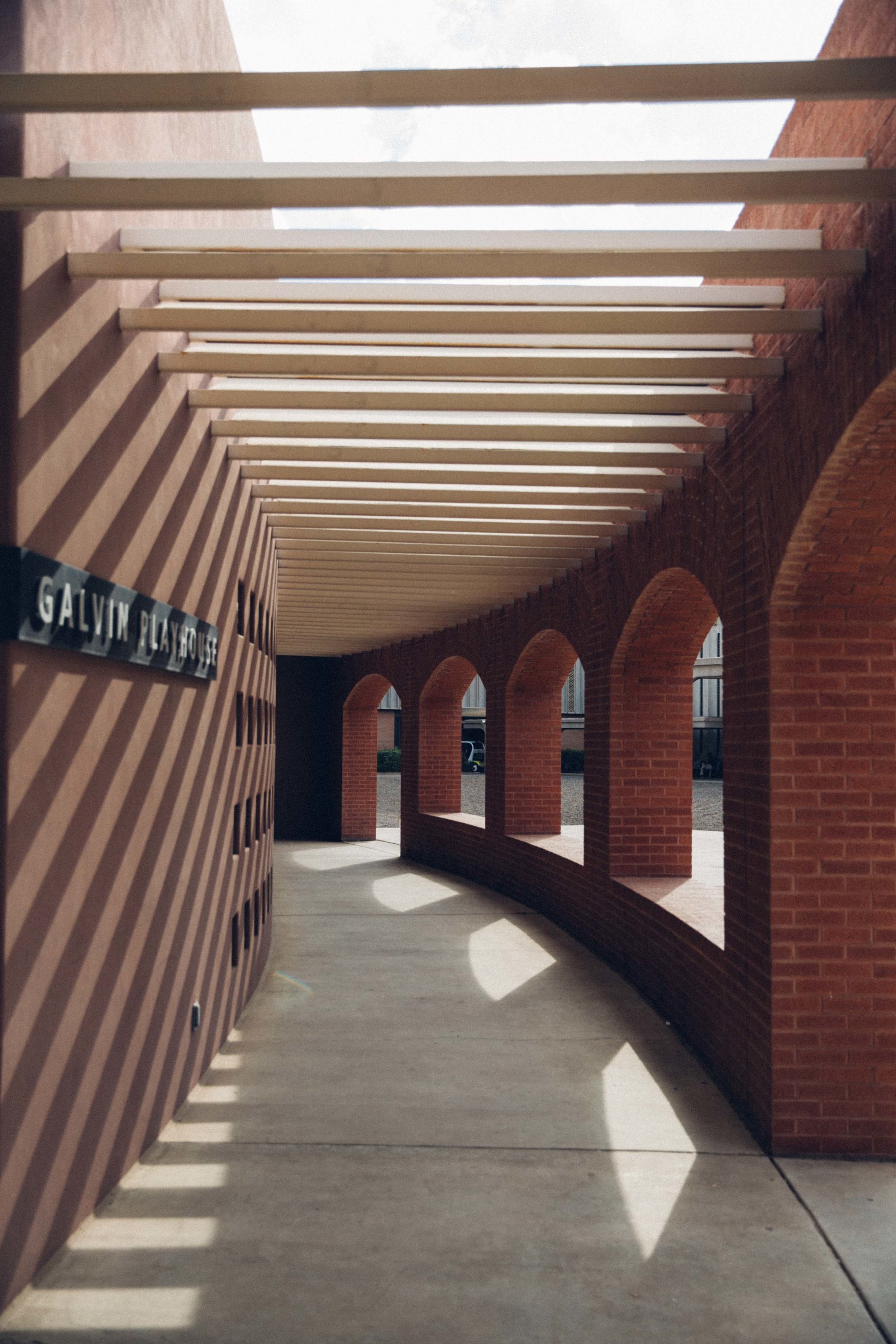
The museum is hidden on the campus with little signage, so there’s barely anyone around that area which means it stays maintained and preserved without much effort. I found the museum because I got lost in my first week on campus and it’s a pretty cool place to get lost when your major is architecture. I really liked it especially because I went in the middle of the day and the shadows under the passageway towards the museum building itself were strong and created an awesome contrast—and instagram picture. I liked going there the most because of its emptiness, in a campus with thousands of students constantly walking through, it’s nice to find my own little space to breathe and just notice where I am. I actually saw a couple people using their hammocks in the trees around it, so that’s something to try next time (free tip).
The building is a really good addition to the overall campus architecture, whilst some buildings are over-the-top detailed, others minimal but very modern, and then the museum with classic, timeless simplicity.


